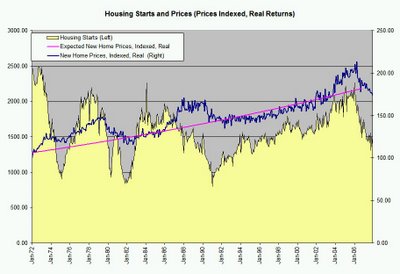
Housing Starts Chart, updated

The pink line is a smoothed expected price, based on a long-run average of inflation + 1.5%.
The blue line is the actual pricing data, adjusted by inflation. I start both lines at 100, and see where prices are vs. where they should be. In the background, you can see raw housing starts data from the Ecowin database, gathered via Factset.
Finally, the pink line ends where there is no more data - later data is my prediction.
One's got to think there's no bottom yet.


0 Comments:
Post a Comment
<< Home