Output Gap - Negatively Correlated to S&P 500 Returns?
Recently, I reiterated the fact that I do have some "quant" in me. Minus the PhD, of course.
I carry around a book so that when I get an idea of a quantitative market experiment, I jot it down. The book is filled with ideas. Tonight I got an auto-email from the St. Louis Fed that the GDP stats were updated so I dug in. My cleats kicked some dirt, the batter's box disappeared into the dust, I spat a couple two, three times, and - oh, wait, that goes back to my baseball days. Anyhow I felt that I would share the beginning of one of my ideas with y'all. There's more work to do on this yet.
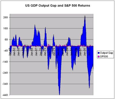
The below chart is kind of hard to understand. Mostly, you want to note that when the blue area is negative, the pink area is positive. This means that, in general, when the US GDP Output Gap is negative, the S&P returns for the quarter are positive.

Like I said, it's a beginning, but for now, it appears as though so long as there aren't drastic changes in the trend, the logic holds. Excel even says that there is a negative correlation, but I am not quite sure that it is statistically significant. I still need to look at time-delays and trending within the data. Another general observation could be that it appears that and output gap that drastically drops off leads a market decline. Let me once again reiterate that this data is not perfect and we all know generalities are tough to live by. But, it's the beginning of an experiment and it appears as though there is promise in it. I would love any input or prior knowledge of such an experiment.


0 Comments:
Post a Comment
<< Home