The "BP's" and Oil Stocks
I wanted to share something with you that I just learned more about today on Stockcharts.com.
The "BP's" as they are called go beyond just the ones I have linked to on the right ($NYSI and $NASI). The Bullish Percentage Indices are very simple - they count up the number of stocks that are acting bullish versus the total number of stocks. Then, they divide the number to come up with a percentage. On the right, I have linked to some charts I use of the $NYSI and the $NASI.
What I learned from the stockcharts.com "Market Summary" is that there are "BP's" for a few of the sectors, as well (this is an awesome page to view daily if you are like me). So, let's look at the $BPENER, which is the oil stocks "BP". $BPENER CHART
So, what the hell am I looking at? You ask. Well, pay attention to the blue and red lines, first off. Those are the 8 and 12 day exponential moving averages. Note that it takes alot of movement - or a new trend - to get them to cross. Next, look at the fact that the actual BP line (The black one) is almost 100%. 100%! Every oil stock is going up? That's what I like to call "saturation" - and it works alot like the nasdaq bubble of 2000/2001. When EVERYONE is on the train, who is left to get on the train? Nobody. So, who is left to keep buying oil stocks to push them higher? Nobody.
This leads me to believe that oil stocks are topping. I have other reasons for believe this as well. We'll get to that in a bit.
NOTE THAT I AM NOT RECOMMENDING ONE SELLS ALL OIL-RELATED STOCKS. Tops take time - alot of it. The last oil stock top saw the oil stocks about 5 weeks in March / April of this year (and, wow, did the BP do a good job of showing it to you ahead of time).
Now, let's look at the actual oil index price movement. After all, the BP chart is not a chart of oil, it is a derivative of it. And, we don't invest in the derivatives - the PRICE is what is important, right? For this, we'll look at the OIH (an oil-based Exchange traded fund)
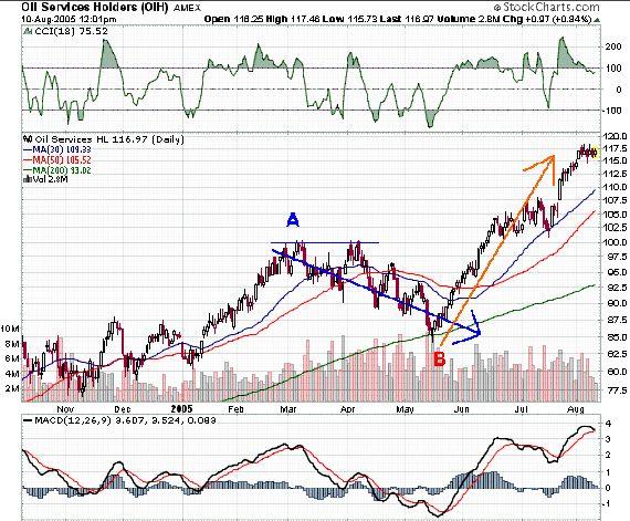
At point A, if you kept the $BPENER chart open, you will notice that you can compare what you see on that chart to movement in the OIH. Notice how a top was forming while the $BPENER was saturating itself. Also notice how long it took for this pattern to work itself out. The original top formed in the second week of March, but, a month later the OIH returned to its March highs! Note, though that the $BPENER indicated had fallen, and, though it looked like it might have sprung higher, it did not, thus confirming the top.
Now, at point B, notice how the $BPENER has fallen so fast that it is getting to the point of saturating itself in the negative direction. Then, on the OIH, the price touches the 200 day moving average, forms a "hammer" candlestick and has rebounded ever since that point.
The $BPENER did not pick the exact bottom or top. It cannot do that. What it can do is offer some nice clues. Remember, you can't buy shares in the $BPENER, but you CAN buy shares in the OIH, or Exxon, or Chevron Texaco. My point is that price is the most important. Let's say that because of the price pattern in the OIH, we bought it near what has now proven to be a bottom at point B. When the $BPENER started to show signs that we were correct, we could have bought more. And, now would be the time where I would start looking to lighten up a little bit. Can prices go higher from here? Absolutely, and they probably will (The OIH is up over $1 today). But, picking exact tops and bottoms is impossible (and trying to do it has ruined many an investor).
So, the BP's can offer some nice clues. View the "Market Summary" page on Stokcharts.com. There are several BP's you can view!
posted by rvb1977 @ 8:49 AM
![]()


0 Comments:
Post a Comment
<< Home